One of the first projects I tackled after we moved into Glen Villa in the late 1990s was what has become the Yin/Yang. A low, circular stone wall on the Big Lawn was full of overgrown highbush cranberry bushes. (I wish I had a photo to show you, but I don’t.) I loved the bushes with their brightly coloured berries. I loved the birds they attracted. But they were too tall. The relationship between the wall and the shrubs was out of whack. Way out.
I considered pruning them to lower the height of the bushes but decided that removing the top three or four feet involved a ladder that would frighten an astronaut. So I dug up the shrubs and cleared the bed entirely.
Over the following winter I searched for a planting scheme that satisfied me. On other parts of the property I was adding elements that reflected the history of the site or our family’s personal stories. Could I do something similar here?
There was no shortage of history to work with. The low stone wall and the taller crumbling one near by were remnants of the old resort hotel that gave our property its name, Glen Villa. It was a huge hotel that attracted visitors from all over North America. The circular stone wall was a turn-around point for the horse-drawn carriages that delivered guests to the hotel’s front door.
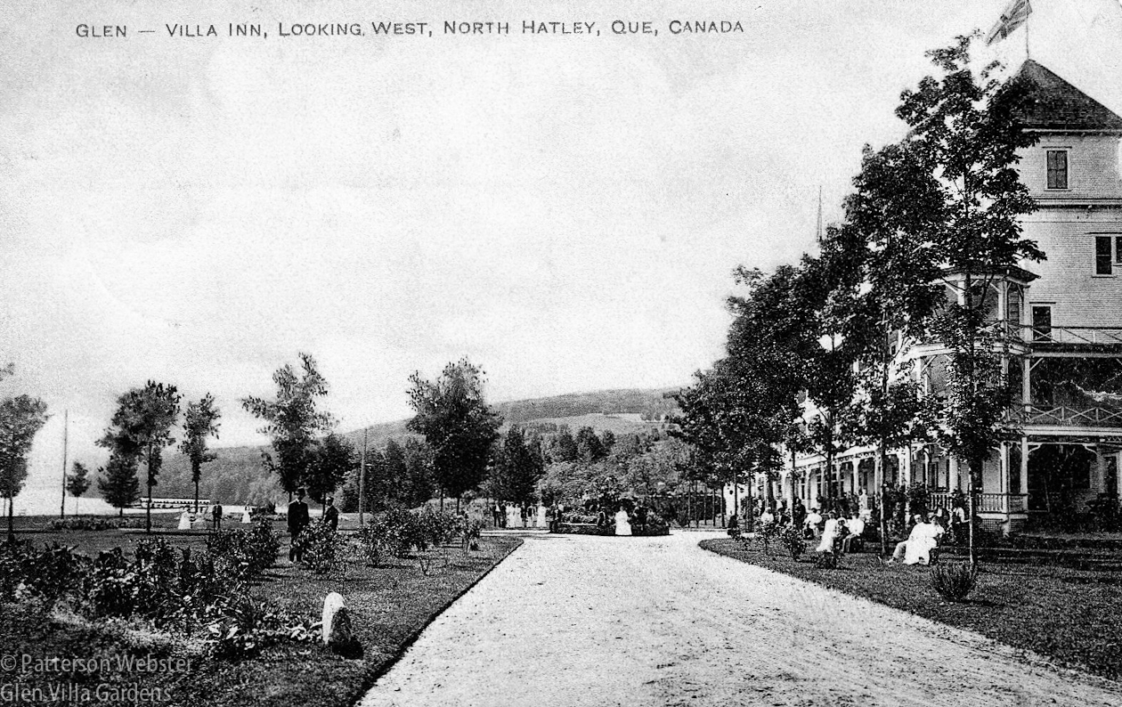
This old postcard shows the circular wall that was in front of the hotel. Glen Villa Inn was built in 1902 and burned down in 1909.
A close-up of the same image shows a young woman in white sitting on the circular wall, while other hotel guests sit in chairs on the lawn or gather nearby.
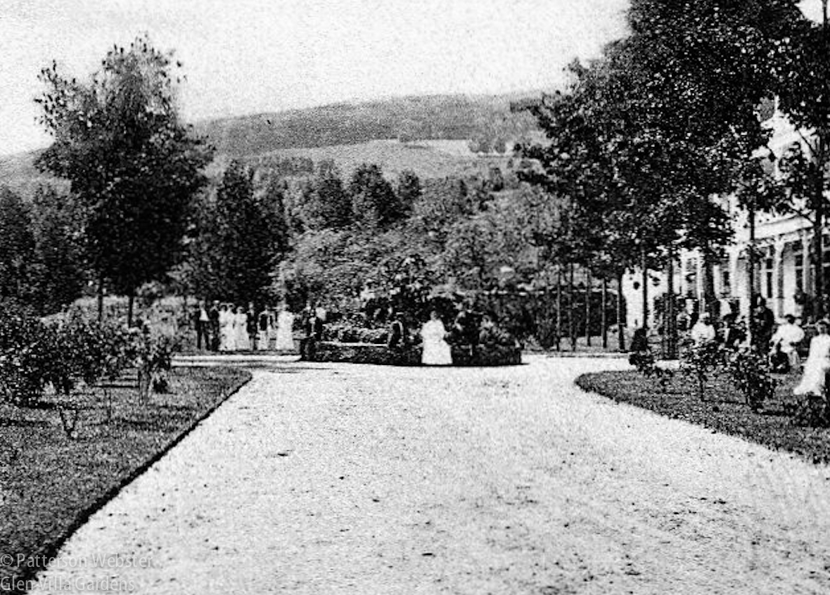
Was it obligatory for ladies to wear white in those days? The open fields on the hillside in the distance are now covered with trees, part of a forest area conserved in perpetuity.
How could I reflect the hotel’s history in plants? I tried to figure out what was planted in the circle originally but the image was too fuzzy to tell. Another postcard showing a planter on the lawn suggested an alternate approach. But did I really want a structure like that standing over the wall with vines twining up it?
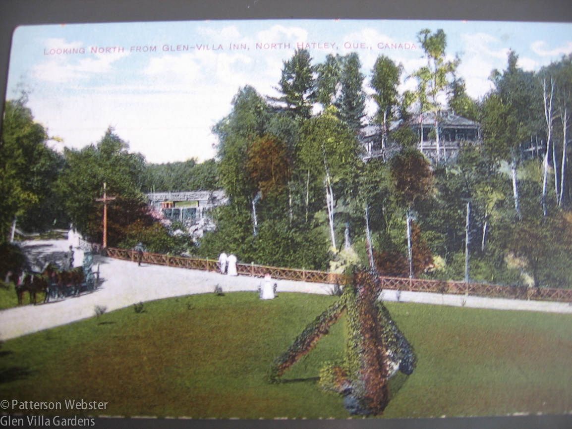
Hotel guests promenade along the drive and up to the waterfall. The building in the background is the club house for the hotel’s 9-hole golf course.
I went back to sketching and dreaming.
I’m an (occasionally) organized person. In a file marked Yin/Yang I came across a sketch of possible design ideas and plant possibilities. Since the hotel was a late Victorian construction, I considered using flowers that Victorians would have loved. Victorian exotica, I called them. I thought of arranging plants of different colours like slices of pie, or bands of colour set one inside the next like a child’s stacking toy, or some variation on the horticultural clocks that municipalities used to plant. I played around with ideas about height and colour, wondering how the circle would look if the plants became taller as they moved towards the centre or the colour became more intense.
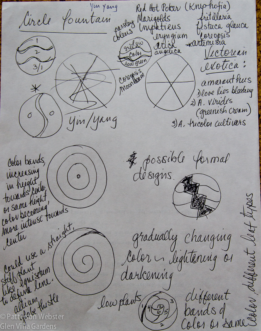
My sketches show several ideas that were far too complicated to execute. I shudder to think of the maintenance for any one of them!
The lack of reality in my dreaming reflected my level of inexperience: I thought I could plant anything I could imagine, and could keep it looking as orderly as a drawing. I knew far less about plants than I thought I did. How otherwise could I have listed Equisetum as a possibility? Did I think the soil in the circle, often baked dry, would keep it from invading nearby damp ground?
An asterisk beside one drawing, my rough sketch of a yin and yang, indicates that it was the design I chose. More than forty years ago, during the Cultural Revolution, my husband and I lived in China, and using the yin yang symbol was a way to recognize that part of our family history. Plus it was a simple design, much easier to implement than any of the more complicated ideas I had drawn.
My friend Myke says he suggested the yin and yang design, and that may be true. He definitely suggested the plants I used the first year, annuals that emphasized the idea of opposition that is intrinsic to the Taoist philosophy behind the design. I followed his advice and for some years used taller and shorter plants in hot and cold colours, Celosia ‘New Look Red’ and silvery Dusty Miller.
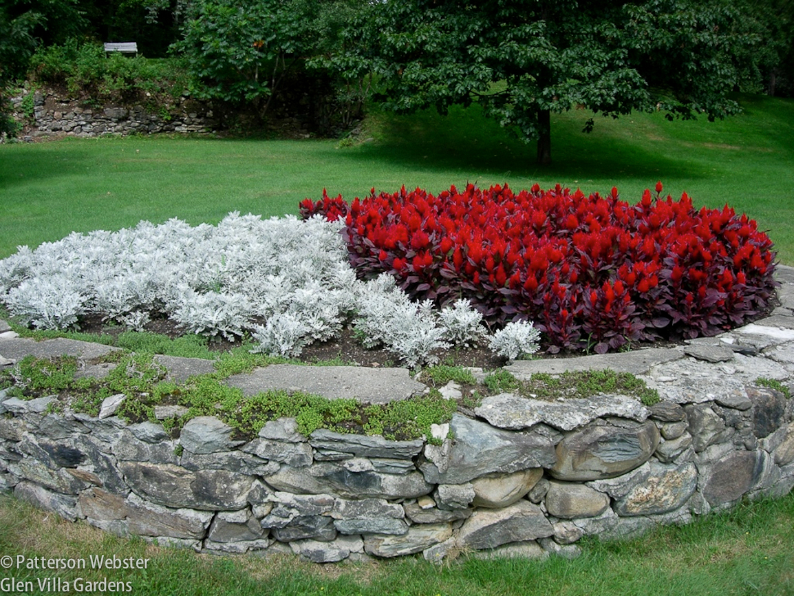
This photo from 2007 shows the colour contrast along with a crumbling wall held together with self-seeded rock plants.
A few years later, I installed a stainless steel strip to separate the two colours and clarify the design. To make it resemble the Taijitu symbol more completely, I added a small steel circle inside each half with plants of the opposite colour. Standing on top of the nearby stone wall, the yin yang shape was clear. But by the end of the summer, the bit of red on the silver side looked very odd indeed.
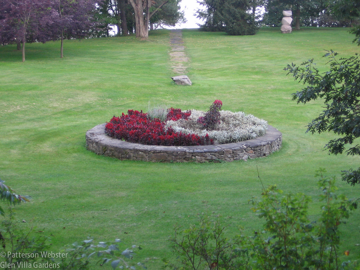
I was standing on top of the foundation wall of the hotel when I took this photo. The straight asphalt path beyond the circular wall led from the lake to the front door of the hotel.
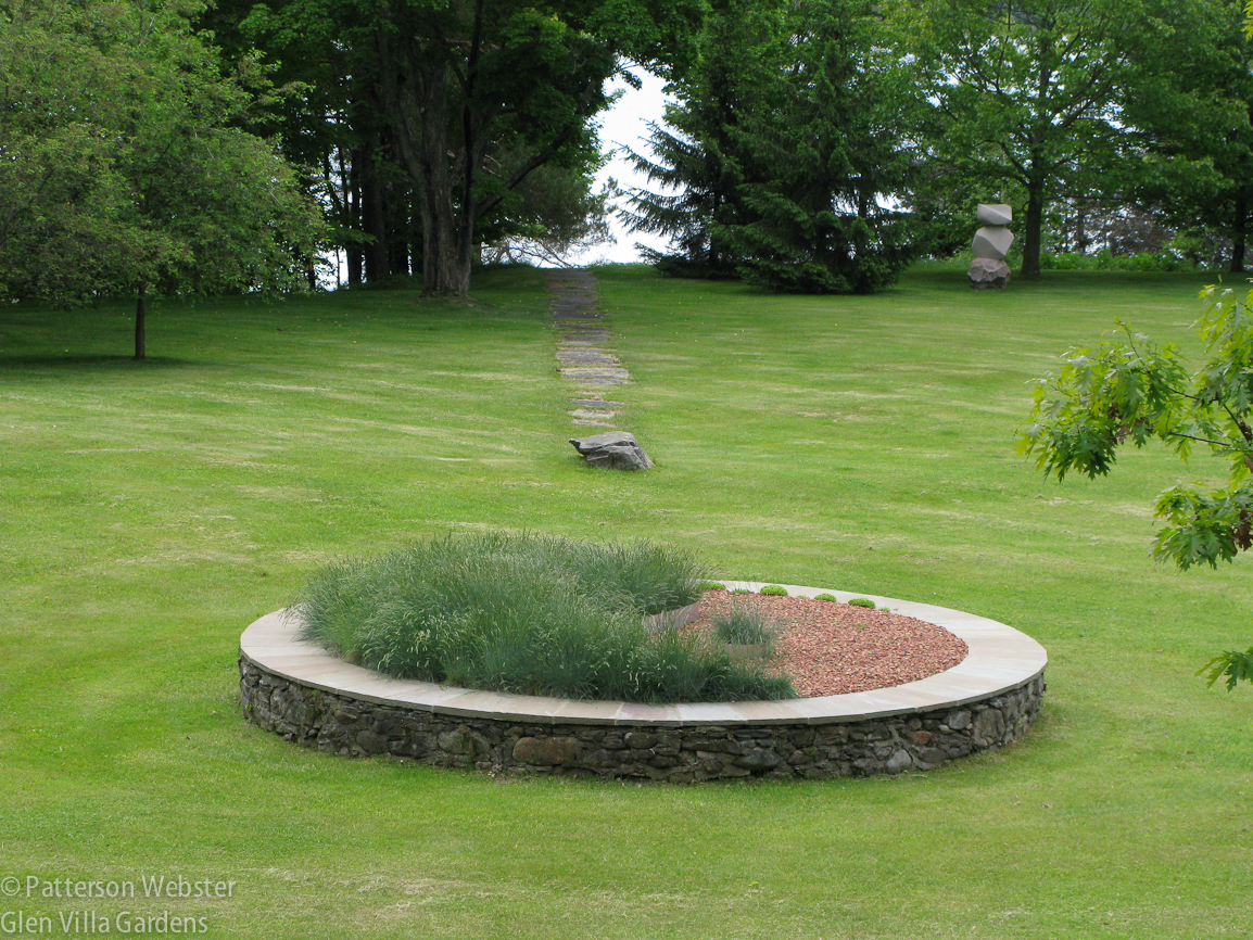
After a few years, I got tired of planting the space every year and began looking for perennials that could do the job. I chose blue fescue (Festuca glauca) and red brick mulch — an unusual combination that I knew many people would question but one that suited my purpose. I liked the additional point of contrast, one side alive and growing, swaying in the breeze, the other side just sitting there, doing nothing. And since the wall was crumbling more every year, I added a bluestone coping to hold it together and to give the circle a cleaner, more contemporary look.
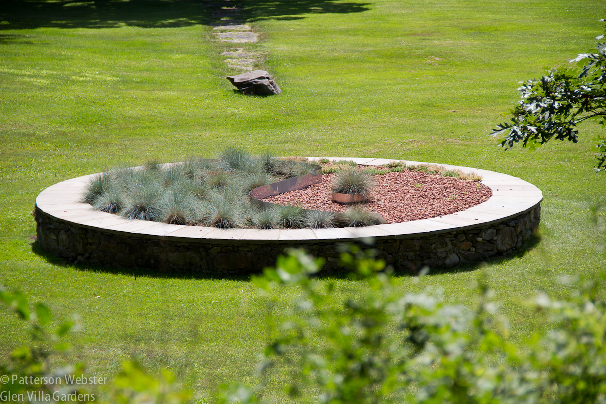
I wanted the plants to be evenly spaced to emphasize order and modernity. Creating straight lines inside a circle proved impossible.
Do you know that garden saying, that the first year a plant sleeps, the second year it creeps, the third year it leaps? The Festuca didn’t wait for year three. It exploded. Early in the second summer it looked bushier than the highbush cranberries had ever been, although considerably shorter.
The solution to the exuberant growth seemed simple: divide every clump and then keep the clumps buzz cut, short front and sides. Which I did. For a year things looked ok. Not great, but not too bad. I thought perhaps I’d cut the fescue back too severely, so I let it grow. But by mid-way through last summer, it became obvious. Nothing was working. For whatever reasons (surely not because I’d fallen behind on the weeding) the grasses weren’t growing. The mulch looked tired and there was no contrast in height from one side to the other. The effect I was going for just wasn’t there.
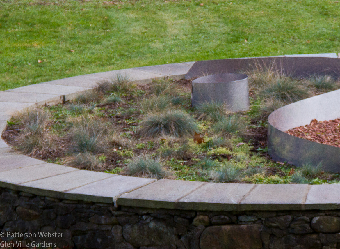
At some point I realized that the small circle of steel was too small so I made it larger. The weeds between the clumps of grass got larger without my help.
This year I’ve changed things yet again. Last week I dug up the few remaining clumps of grass and planted Artemisia ‘Silver Mound.’ I may need to trim the clumps to keep the them plump and round, but I hope that once a year will be enough. (Can anyone confirm this?) The red brick mulch remains — minus the yellow sedum that I will continue to pull out in handfuls — but if it continues to look tired, I will spray paint it a brighter red.
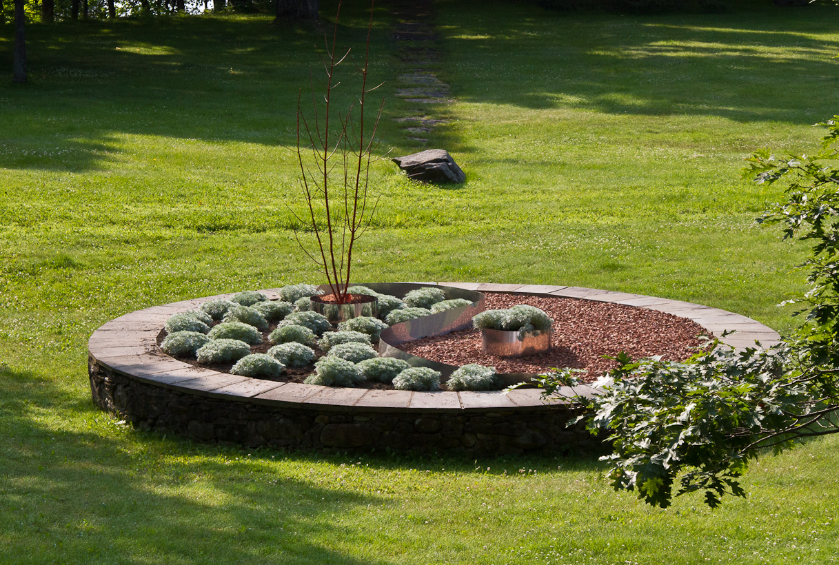
I need to trim the tree branch on the right and add some silvery-grey gravel as mulch around the Silver Mound Artemisia. Then this iteration of the Yin/Yang will be finished.
To add more contrast in height I’ve put a tall tree in the ‘dot’ on the silver side. Not a regular tree but the top of a dead one that I’ve painted red. It is sharp and spiky and contrasts well with the soft foliage of the Artemesia.
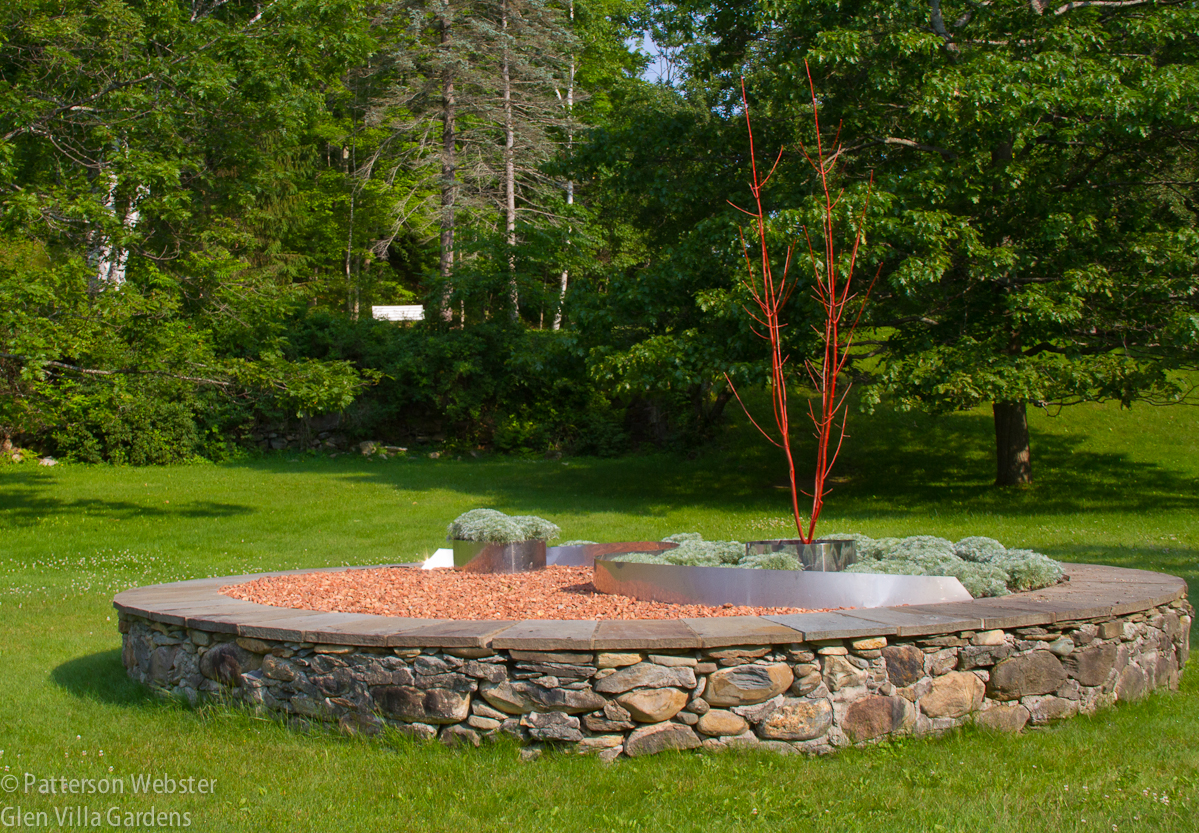
A close-up from a different angle shows the dead tree silhouetted again a backdrop of green. The white bench in the background sits on top of the foundation wall of the hotel. The wall itself is in shadow.
Evaluating the Results:
The contrasts between the two halves of the Yin/Yang keep multiplying. I started with contrasting colours, but over time I’ve added other differences: high and low, hard and soft, spiky and round, dead and alive. Are there other contrasts to consider?
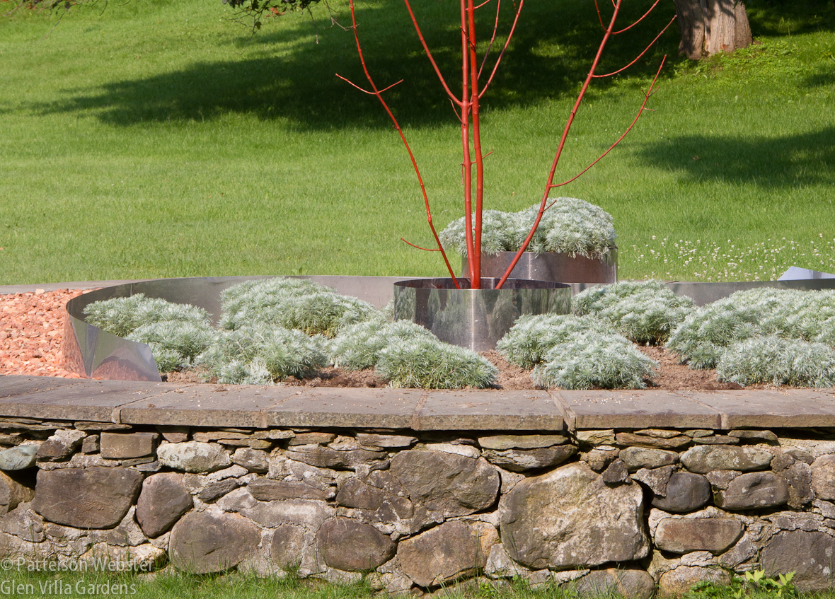
The elements of contrast stand out here.I have to add the silver grey gravel mulch underneath the Artemesia. I hope to do that later today.
The steel strip dividing the two sides defines the space and is holding its shape well. The proportions of the ‘dots’ to the space as a whole are right now that I made them larger. Is the dead tree too tall?
It is too early to know whether this variation on the theme will be effective a year or two from now. I am concerned about keeping the Artemisia trimmed well enough to maintain the dotted (dotty? Some would say that applies to me more than the plant.) effect I want.
The bigger question is, does the idea work? Some visitors shudder when they see the Yin/Yang. Even if I explain how I’m telling the story of our family throughout the garden, connecting it to other times and other people, they shake their heads. It isn’t pretty, they say. And in any traditional sense, this is true.
But does this matter? (Remember Fletcher Steele’s counsel: “The worst vice in a garden is to be merely pretty.”) Making something pretty wasn’t my intention. If it were, I might have climbed that astronautically tall ladder and trimmed the highbush cranberry down to size.
Still, I have to ask if intentions are enough. And when do I call it quits? If this version of the Yin/Yang fails, will I change my approach entirely? What other ways can I think of to represent history inside a crumbling stone circle?
Ideas, anyone?




I can’t see anything else here but roses, peonies, tiger lilies or something blooming and said this before! Perhaps incorporate some spokes on a wheel of time? I would go back to the drawing board on this one!
I know, Robert, you are one of the ‘I think she is as crazy as the idea itself’ people. I can imagine roses but since they don’t add anything to the story of the site, I’m still giving them a pass. Maybe one day…
The crazy ideas are just the beginning and throw in a little madness…….perfection! Hope you are enjoying this summer season!
This is a fascinating post. I loved both the glimpse into the history of Glen Villa and your design process. I don’t have any suggestions to offer, but I’ll be very interested in seeing how you proceed.
So will I, Jean! I always think I know how I’m going to proceed but plants have a way of changing my mind! So once again, I’ll give this variation a year or two to see how it works out.
I think it’s a lovely piece of horticultural performance art. Going back to your fescue plan, might blue oat grass have stayed a little more reliably spiky?
Helenbee, I think you are right, the blue oat grass probably would have stayed spikier. I’m going to give this planting a year or two, then I’ll evaluate again. Thanks for the suggestion.
I love thinking of this as a “piece of horticultural performance art.” I guess that mean I call myself a horticultural performance artist! Love it!
I find the idea pretty interesting! I really love the fescue version right after planting. But you’re right — after that burst of growth the plants obscured the design. You’d have an easier time in a mild-winter climate, where you could grow slow-growing succulents or golden barrel cactus. Two images for your consideration, from my blog: http://www.penick.net/digging/images/2008_05_13%20Gardens%20on%20Tour/Spencer%20garden_Blue%20glass%20&%20agaves%202.JPG and http://www.penick.net/digging/images/2014_04_29_Desert_Bot_Garden4/34_Cactus_sundial.JPG. What about forgoing plants altogether and using colored glass or stone to achieve the effect? Or clustered red gazing balls on one side? Now I’m the one who seems crazy, right? Pam/Digging: penick.net/digging
Pam, I love the photos, thank you for digging them out. The recycled glass is much brighter than the brick mulch I’ve used and I like that extra sparkle. I have some bags of grass I order a few years ago — I’ll take them out of storage and see if any of the colours work. If they do, I’ll post a photo.
The sundial is fabulous! I constructed a sundial in a clearing in the woods, using an existing tall dead pine as the pointer, but that installation has a different feel and a different purpose. I definitely agree, if I lived in a milder climate, I’d consider using barrel cactus, maybe using the tones you showed on both sides. And believe it or not, I actually considered red gazing balls! I trashed the idea because I wanted one side to be living and growing and the red brick mulch was already there. But if this variation doesn’t work well after a year or two, it will definitely be back to the drawing board. The area gets lots of sun so a sundial clock appeals to my sense of humour and my sense of history. An up-dated version of a Victorian bedding scheme: perfect!
I like what you are trying to do. Roses might be OK, but only low-growing landscape roses. If you’re keeping the crushed rock side, how about making the other side look green, soft, and colorful? Phlox subulata or divaritica, Geranium ‘Biokovo’ or ‘Rozanne’, Veronicas, or Saponaria strike me as possibilities.
Jason, this is very interesting suggestion and I like the plants you mention. The Artemisia may remain soft to the eye but if not, I’m going to rethink from scratch.
Good Blog..! your blog is very helpful… I am happy to find this post very useful for me, as it contains lot of information. I always prefer to read the quality content and this thing I found in you post. Thanks for sharing.
catalonia villa rental
Blue fescue always peters out for me after a year or two. Someone told me it needs to be divided regularly to maintain vigor. But you did divide it . . .
Very interesting to know that I’m not the only one who has trouble with blue fescue. One of the advantages of blogging is getting this kind of feedback. So, do you have any experience with artemisia ‘Silver Mound’?
Years ago my sister-in-law shared some of that with me. It didn’t make it through one winter in my clay soil. I think it likes free-draining soil.
Mine has lasted just fine but I need to prune it to keep it looking like a mound rather than a scraggly mess. Wish I didn’t have to… more work!