Et, voila! Welcome to the new Glen Villa Gardens website, Site and Insight: Reflecting on Art and Landscape.
The new Site and Insight merges my old website and my weekly blog, and adds new features with more information about gardens, landscape and art. I’m delighted with the appearance and the ease with which readers can move through the various sections. At least, that’s what I think. But when you are familiar with something, it seems straightforward, and that isn’t always the case for a newcomer. So today’s post is a short overview of what you’ll find on the new website and how you can navigate through it.
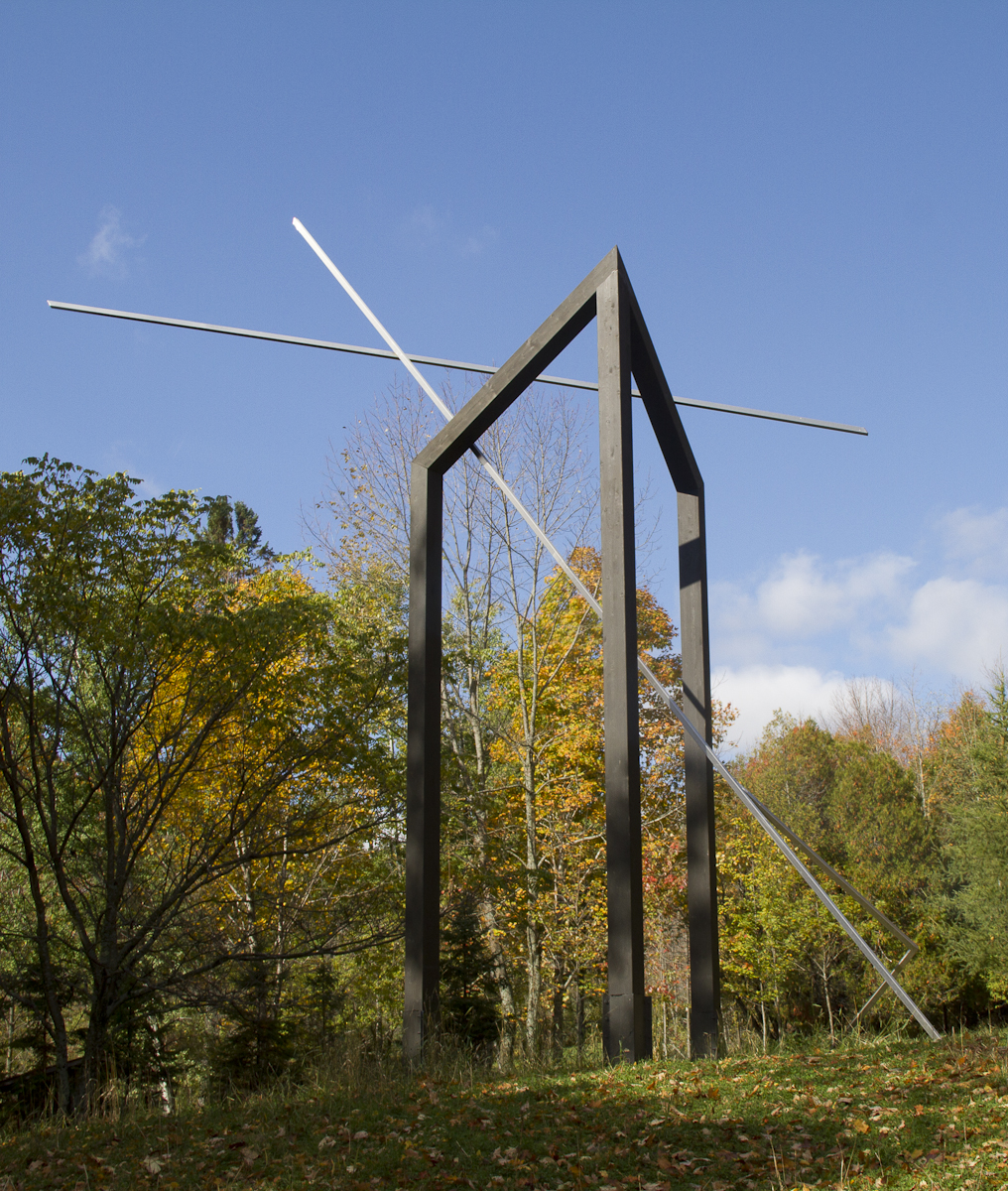
Art takes pride of place. My own portfolio is featured in the Art section and includes pieces made on commission and pieces I’ve made for Glen Villa, my garden in Quebec.
Glen Villa remains an important element of the website because it is there that I try plant combinations, work out designs and experiment with ideas for art outdoors. The Glen Villa section now shows photos of different garden ‘rooms’ and a sample of the art on site, as well as sharing a bit of the history of the property itself.
A new section covers a selection of talks designed for groups across Canada and the United States. Two of these reflect the small group trips I’ve led in recent years through gardens in England and Italy. Others look at aspects of garden design and the art of observation — or how to get the most out of a garden visit. Two of my favourite talks are still there. Art in the Garden: What, Where and Why is a popular choice for many different audiences. Glen Villa: Creating a Personal Landscape tells the story of Glen Villa and suggests ways to make a garden reflect the personality of the garden-maker.

The Art of Observation: one of several new talks I’ve developed
In the About section, I tell you a bit about myself and about my philosophy on gardens, art and landscape in general, as well as sharing some comments from other people.
And what about the blog? Easy. Simply click on the word ‘Blog’ at the top of the Home page or on the photo of the tree at the bottom of the Home page and you’ll be taken straight to it. Once there, you can read the latest entry. And you can scroll back to read previous entries, back to January 2013 when I started writing the blog.
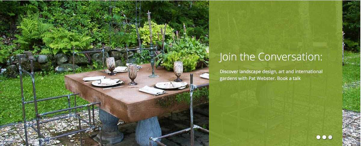
Wherever you are in the website, if you want to pause on a photo or get a larger view, simply click on it. The three circles at the bottom of the banner photos on the different pages allow you to move at your own speed from one photo to the next or to skip from one photo to another. On the Art page, a large plus or minus sign will appear allowing you to move forward or backward, taking as much time as you want on any image.

With any new enterprise, occasionally there are glitches. If you run into one, please let me know and I will do my best to correct it. You can reach me at [email protected]
Join the conversation! I look forward to hearing from you.


I like how you use the flourish in the ampersand in Site and Insight as a graphic symbol that ties in the whole site. Someone did a good job with the graphic design.
Thank you, Kathy. I agree — the film Blue Lotus Creative did a great job!
Brilliant. Just about to have a holiday – a good browse on here will be one of my holiday treats! Xxx
Simply going away is a holiday treat. Hope it is to someplace wonderful.
Canterbury, just like a Chaucer pilgrim. (except I’m not walking there!)
It would be quite a hike from Wales.
It would be a long hike from Wales. But if the company is good, and the tales interesting, it could be fun.
The new site is beautiful, very appealing and inviting, not to mention artistic. Well done and congratulations.
Thank you, Amy. I appreciate the support.