Winter is almost here in Quebec, which means that not much is going on in the garden at Glen Villa. So instead of moaning about that, I’m remembering one of the gardens I visited in England last May.
Malverleys is a large private estate, rarely open to the public, so the small group of gardeners who were on the tour I was hosting was fortunate to be able to visit. We were doubly fortunate to tour the garden in the company of Mat Reese, the head gardener. Anyone who subscribes to Gardens Illustrated, or reads it regularly, may recognize his name — Mat writes ‘Plantsman’s Favourites’, several pages near the front of each issue in which he recommends special plants for each season.
The garden he is in charge of uses contrast as its central idea. Understandably, because Malverleys is a garden of extremes. Old trees tower over a new garden, and recently created views frame a countryside that seems to have existed forever.
Malverleys also shows what can be accomplished when talent combines with wealth. Working in conjunction with the owners, in a few short years Mat has created a garden that celebrates traditional Jekyll-inspired plantings, a style he believes best suits the English countryside. But not content with imitating the past, he is constantly experimenting, and the results of his experimentation show what can happen when contrasts are pushed to the limit.
Easiest to identify (and to photograph) in the ten intensely gardened acres are the contrasts in colour. These range from sharp contrasts within a single border …
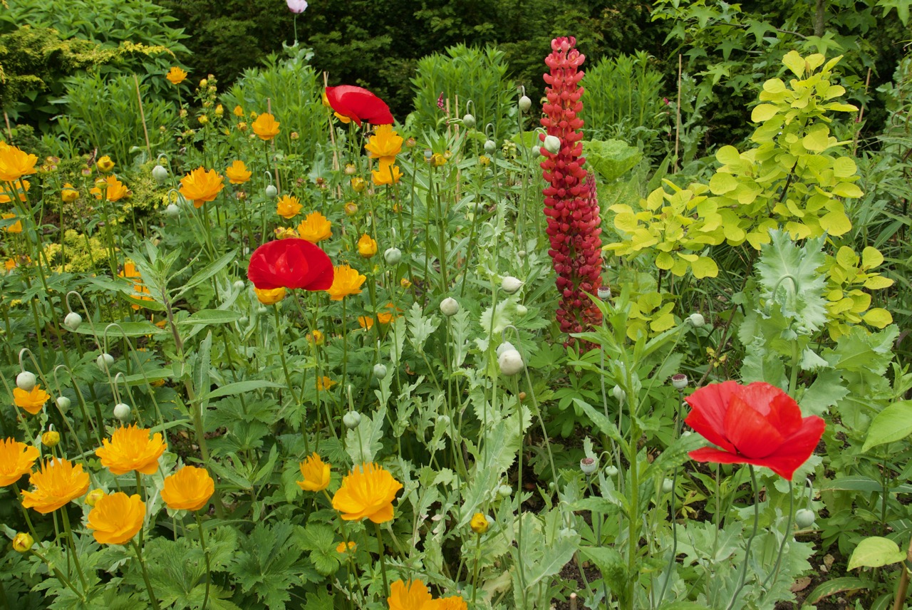
Vivid colours appear in the hot border. Contrasts are more subtle in the cool-toned border but are still dynamic and inventive.
… to contrasts within a single plant.
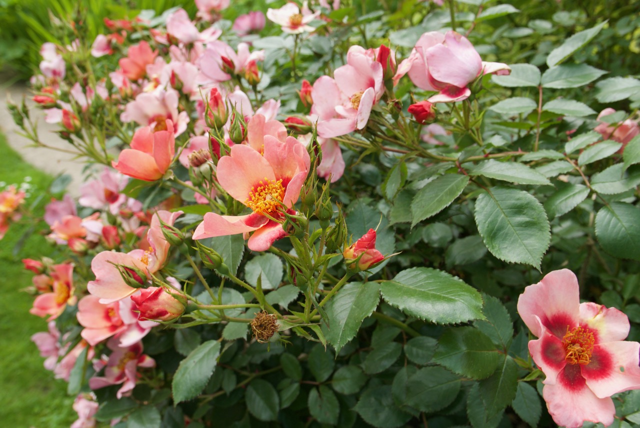
A splendid rose — ‘For Your Eyes Only’.
Less obvious but equally effective are contrasts in texture and size.
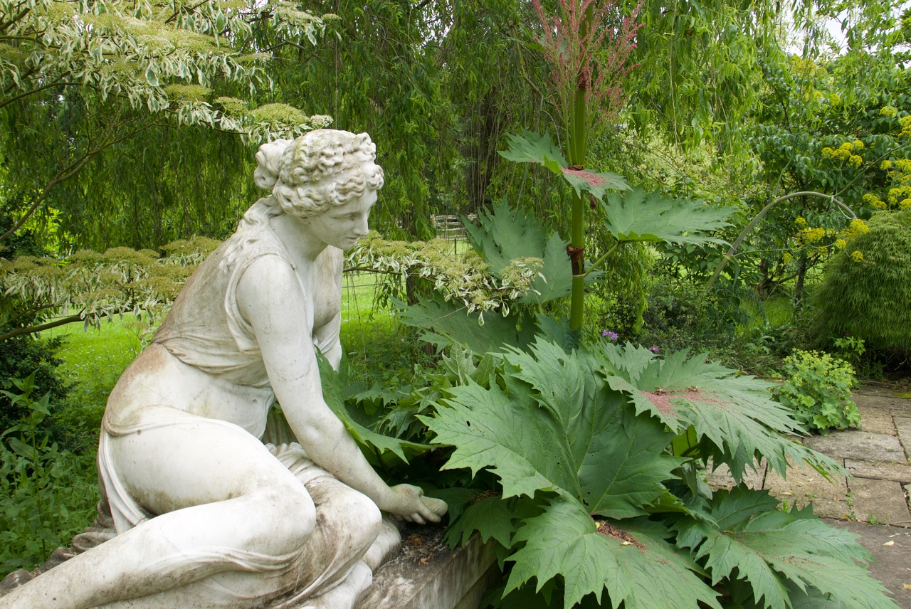
Smooth and delicate white is set off by rough and pointed green in the pool garden.
When the owner acquired the property, none of the current gardens existed. Now open spaces are carefully balanced against closed ones, light against dark.

A sculpture by Mark Quinn provides a focal point for the open lawn and the fields beyond.
In contrast to open fields and a sunny lawn is a dark stumpery, full of mystery and ferns. Some forms are delicate …
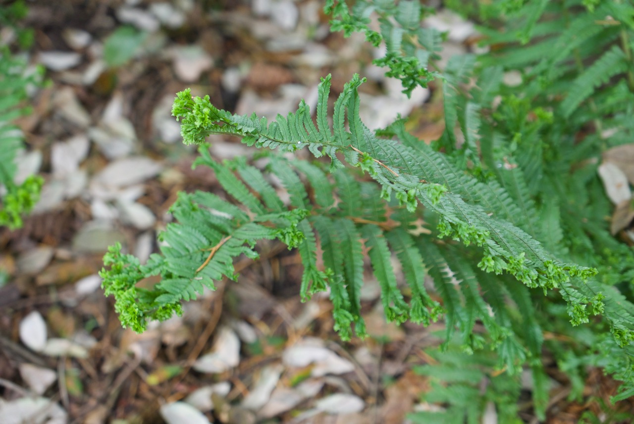
I have no idea what kind of fern this is but I like the sharp green frills of new growth.
…others bold.
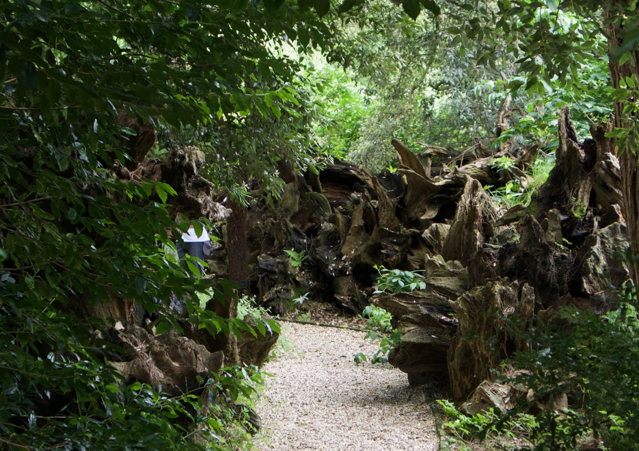
Tree trunks, tree roots and tree ferns line the crunchy gravel path.
Water is handled with equal care. A large pot of water sits in a shallow pool, surrounded by beds thickly planted in cool colours.
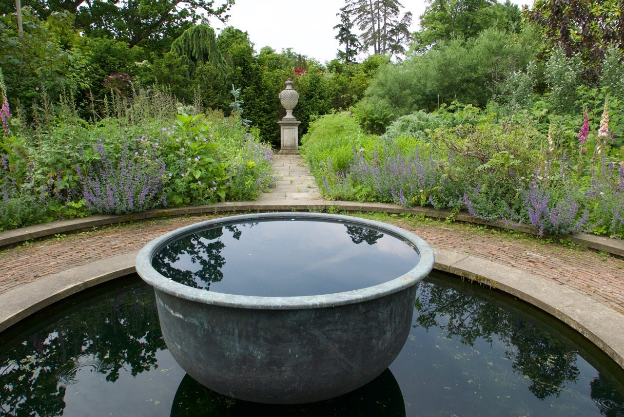
A urn adds a focal point at the end of the path, one of four that centre on the circular pool.
A larger pool surrounded by more vibrant tones reflects the sky.
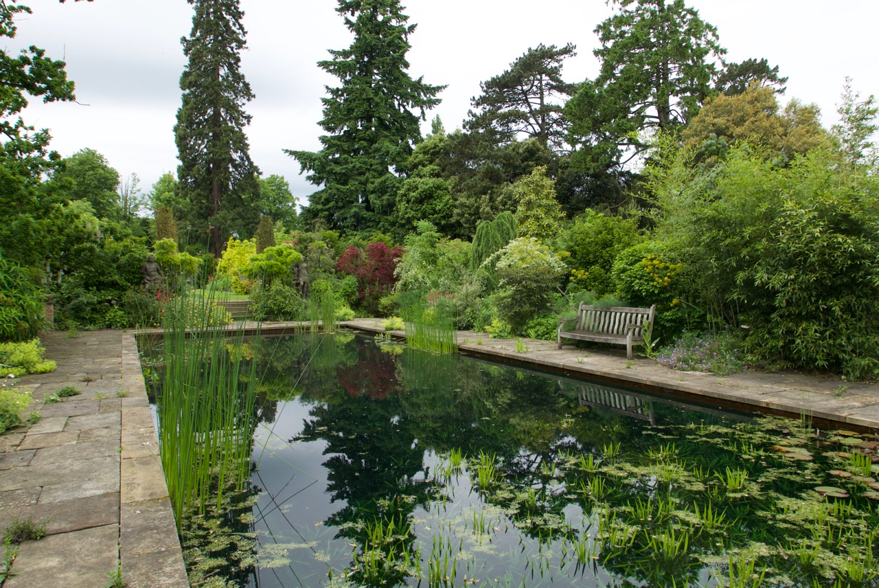
Reflections add another layer of enjoyment in the pool garden. Contrasts in colour, form and texture can’t be missed.
In a section of the garden still being constructed, water arcs from the sides of a rill to form circular patterns, while the sound of the splash adds a new note to the symphony of birds.

The temperature dropped noticeably once the water began to rise and fall.
Throughout the garden, formality is contrasted with informality. Beside the house a recently planted parterre combines yew, boxwood and hydrangea …
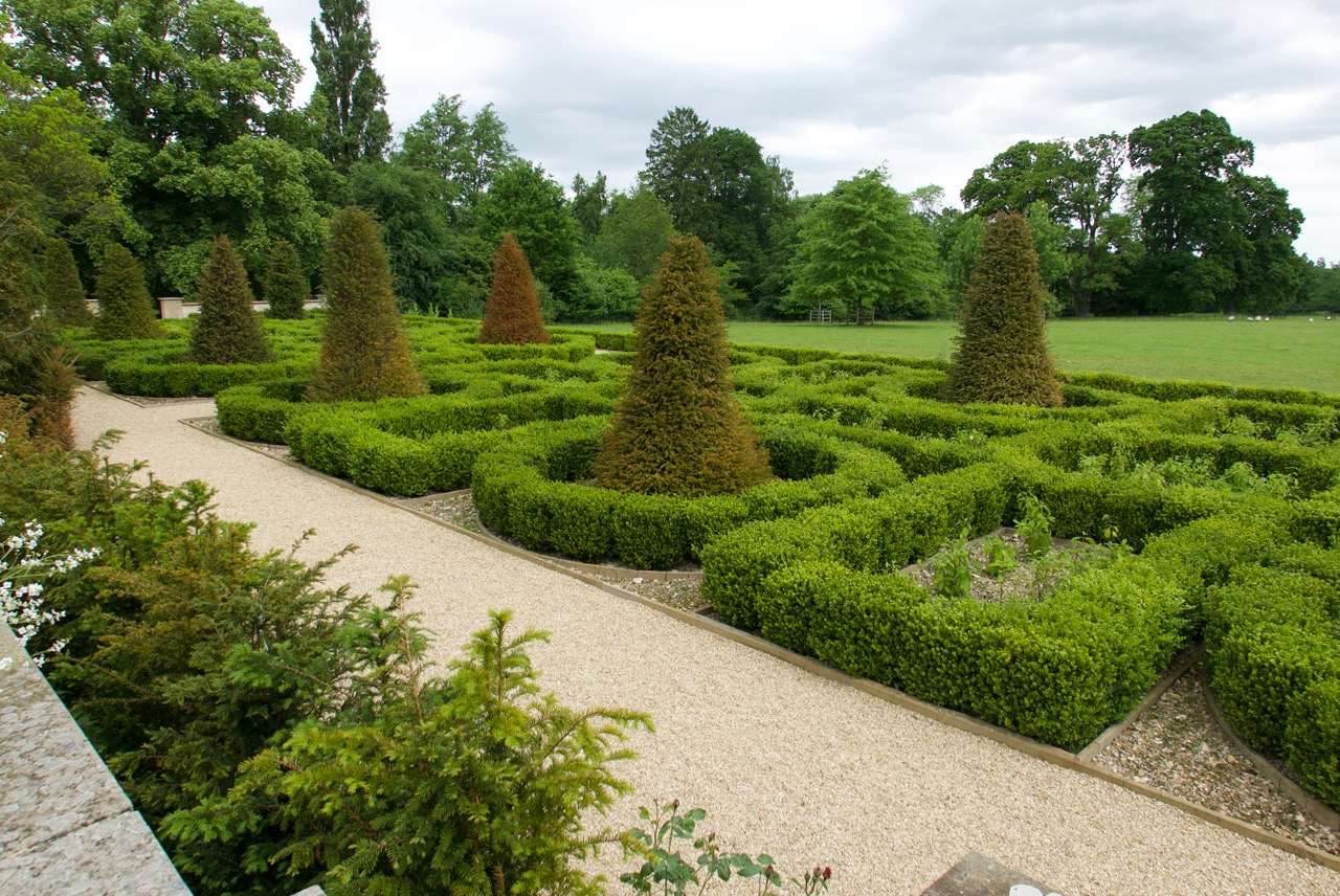
Annabelle hydrangeas will grow beside the yew columns that eventually will fill the boxwood circles.
while in the walled garden there is a meadowy abundance.
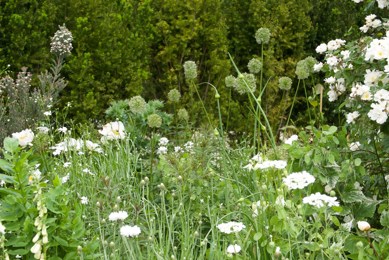
I liked this wonderfully informal planting in forms and tones of white.
Classically influenced statuary at the top of a low set of stairs sets one tone …
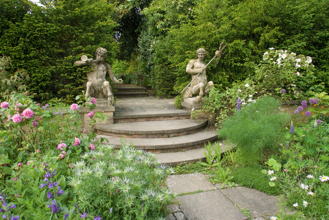
This pair of statues were typical of statuary that appeared in different garden rooms.
while designer chickens wandering through the garden set quite another.
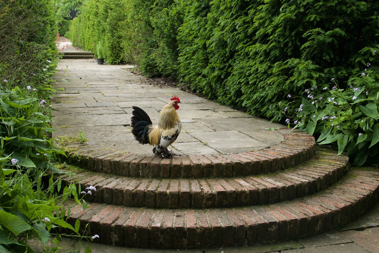
Whose garden is this anyway? The King of the Walk knows, and doesn’t mind telling visitors who’s the boss.
Mat Rees’s title is Director of Horticulture. This isn’t the title used in most gardens of this type, but at Malverleys, a title isn’t the only convention that has been given a twist. Topiary in a flowery meadow, for example. Christopher Lloyd’s garden Great Dixter famously had one, and Rees may well have worked on it when he was there. At Malverleys, the meadow combines the standard wildflowers with perennials and shrubs, and a topiary statue twists its way up amid the yews.
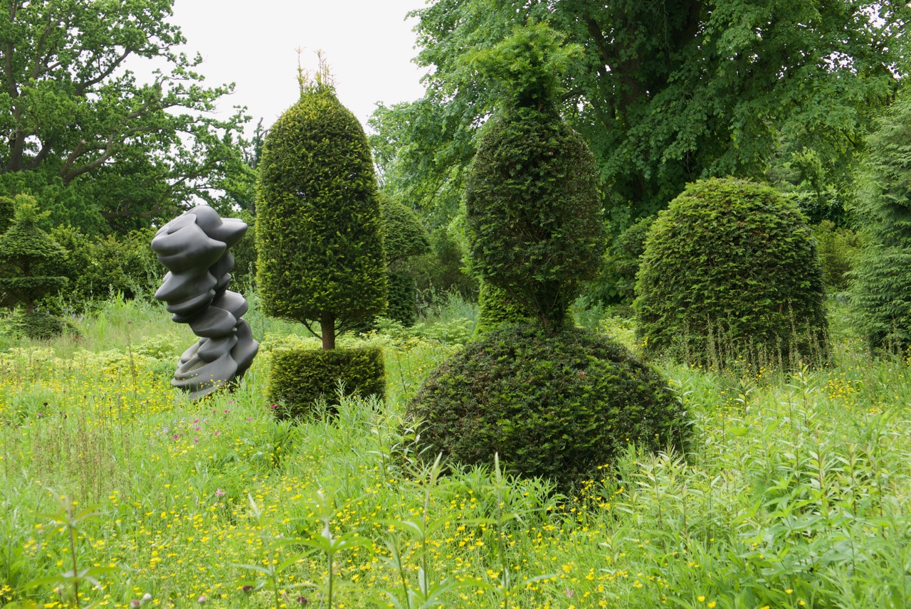
I failed to note the name of the sculptor. If anyone recognizes the work, I’d like to know.
A double border lining a bit of green lawn is a standard feature, a cliché too often made worse by unimaginative planting. Not so here.
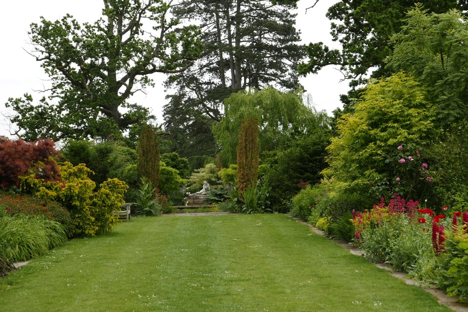
The lawn is wider than most, and longer than many. The pool garden is at the far end.
An old stone path where cracks burst with thyme and self-sown plants is a commonplace that Rees has freshened, both with the variety and combination of plants he has chosen and with the broken pattern inserted in the walk.
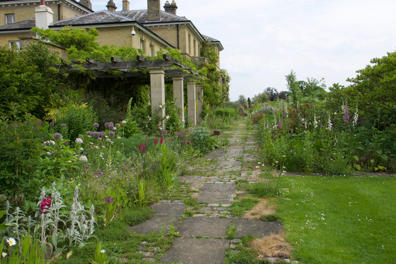
The path may look as if it has been here forever but it was put in place only a few years ago.
And what self-respecting garden of this type excludes a white garden? The very name conjures romance in the moonlight, perfumed yet coolly restrained.
At Malverleys, the white garden is wild, unrestrained, punctuated with touches of colour, on the verge of tipping over into confusion.
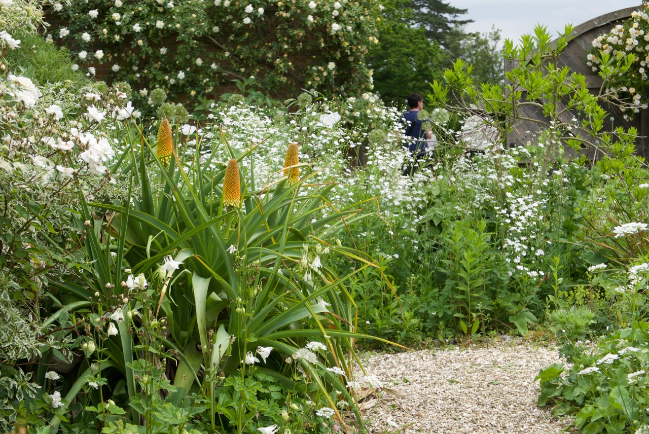
White isn’t the only colour that appears in the white garden but it dominates most beautifully.
Can the same be said of the garden as a whole? Malverleys is a garden built on contrasts — between convention and experimentation, between restraint and lack thereof — and with contrasts as strong as these, finding a balance is essential. Establishing that balance isn’t easy; maintaining it is even harder. And I’m afraid that with the addition of one more thing, one more garden room, one more feature, the balance will be lost. A studied garden will fall over the top.
I hope I’m wrong, for the plans that Rees outlined for the future are exciting: a lake, an arboretum, a series of courses for those wanting to learn more. A few more years will tell the tale.


This garden reflects a quite facinating way to interpret the word “contrasts”. One usually thinks of colour, or yes, shapes of leaves or plants – but this wonderful series of gardens takes this approach to new levels. Love it! Have already “toured” it twice. Great for ideas – albeit rather less elaborate ones.
It’s wonderful when a garden offers inspiration, and I’m glad that my review did, too.
Enjoyed this, as it is hard to get motivated in between the seasons. My stand of birch trees has lost their leaves so fall is done. Perhaps a review of Vivaldi and The Four Seasons would add a little more color!
Vivaldi is always good for a lift.
I do subscribe to Gardens Illustrated and I’m familiar with Mat’s column, so I really appreciated your tour. And yes, so much better to indulge in a tour now, when all is dreary and gray and the snow isn’t far away.
Dreary and grey describes today perfectly. No snow, just rain and low spirits.
Aw, shucks, it’s early for low spirits. Have you considered light therapy?
Sun came out so took light therapy the natural way. Spirits now at normal level!
I’m glad! We cold climate gardeners are hardy souls, but there’s no reason to suffer needlessly.
The sculpture looks like the style of Tony Cragg
I see what you mean, it does resemble some of his sculptures. Thanks for the lead.
http://pad.basingstoke.gov.uk/documents/4753/01/02/46/01024679.PDF
This shows it
Sue, that’s very helpful. Thank you again.
We’ll have to visit this garden if we ever get to England again. Thanks for the tour!
It’s a good place to visit but not easy to gain access. I think you’d like the horticultural exuberance — it’s pretty special.
Like the topiary in the meadow. Have you a longer shot?
Just sent some to your email.
Thank you for the wonderful photographs & very astute commentary.
I was at Malverleys yesterday, Thursday 15th July 2021, and my response has been focused by what you wrote about the balance of the garden, contrasts etc.
The individual small gardens are beautifully accomplished, I think, but there is a major problem with balance. The ‘parkland’ aspects of the garden sit uncomfortably with the intensely planted areas, even though they are, of course, separated by walls and hedges. They need a much more considered balance and connection. The Marc Quinn sits so badly, to my eye. Exposed, over exposed. Too white, sitting in the lush green. Maybe that is the point of that positioning, but it surely doesn’t work for me. Maybe there are plans to integrate it more subtly? I hope so!
In contrast, the Anthony Gormley sits anchored by a magnificent old lime tree, and is so much the better for it.
Mat Reese was a wonderful guide – spontaneous, and so full of knowledge. He referenced Dixter & Christopher Lloyd many times, of course. The wonderful thing for me about Dixter is that balance & connection, a brilliant and, to my eye, complete coherence.
Thanks again.